Visualization with FDFI
This tutorial shows the plotting helpers in fdfi.plots for background data, aggregate FDFI scores, per-sample UEIFs, inference output, and explainer diagnostics.
[1]:
import matplotlib.pyplot as plt
import numpy as np
from IPython.display import display

from fdfi.explainers import OTExplainer
from fdfi.plots import (
    confidence_interval_plot,
    correlation_heatmap,
    dependence_plot,
    diagnostics_plot,
    force_plot,
    summary_bar,
    summary_plot,
    waterfall_plot,
)

rng = np.random.default_rng(42)
Simulated Data
Use a small correlated background matrix so the correlation heatmap and dependence plot have structure.
[2]:
n_train = 200
n_test = 60
n_features = 6

cov = np.full((n_features, n_features), 0.25)
np.fill_diagonal(cov, 1.0)
cov[0, 1] = cov[1, 0] = 0.75
cov[2, 3] = cov[3, 2] = -0.55

X_background = rng.multivariate_normal(np.zeros(n_features), cov, size=n_train)
X_test = rng.multivariate_normal(np.zeros(n_features), cov, size=n_test)
feature_names = [f"X{i}" for i in range(n_features)]

def model(X):
    return 1.5 * X[:, 0] - 0.8 * X[:, 2] + 0.4 * X[:, 4] ** 2

explainer = OTExplainer(model, data=X_background, nsamples=40)
results = explainer(X_test)
ci = explainer.conf_int(alpha=0.05, target="X", alternative="greater")
Background Correlation
correlation_heatmap clusters features by 1 - abs(correlation) and returns the reordered names.
[3]:
fig, ax, reordered = correlation_heatmap(
    X_background,
    feature_names,
    show=False,
)
display(fig)
plt.close(fig)
reordered
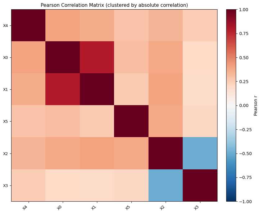
[3]:
['X4', 'X0', 'X1', 'X5', 'X2', 'X3']
Global Scores
summary_bar is the aggregate bar-chart helper for phi_X, phi_Z, and their standard errors.
[4]:
fig, ax, importance_table = summary_bar(
    results["phi_X"],
    results["se_X"],
    feature_names,
    show=False,
)
display(fig)
plt.close(fig)
importance_table.head()
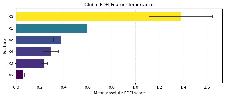
[4]:
| feature | phi | se | |
|---|---|---|---|
| 0 | X0 | 1.380897 | 0.266202 |
| 1 | X1 | 0.598447 | 0.080826 |
| 2 | X2 | 0.376329 | 0.062175 |
| 3 | X4 | 0.290675 | 0.064366 |
| 4 | X3 | 0.238167 | 0.026621 |
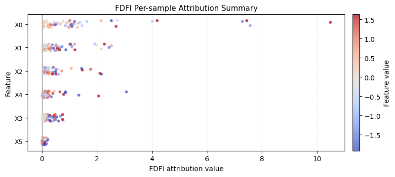
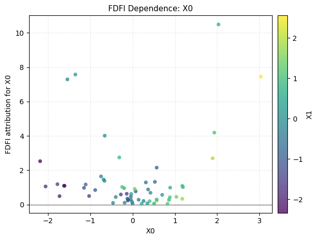
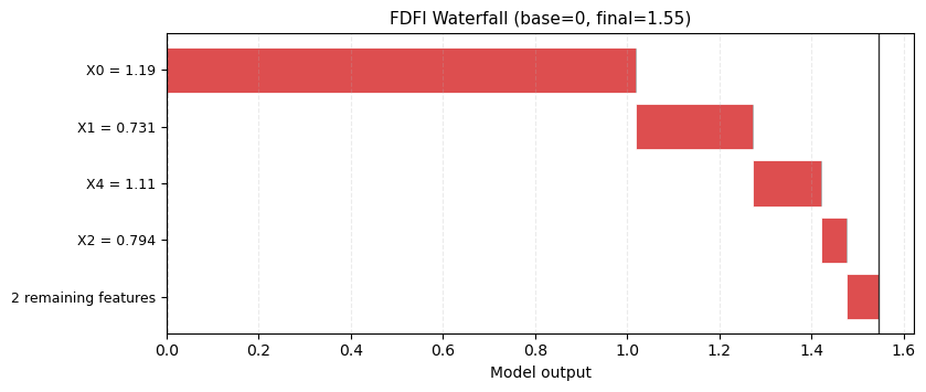
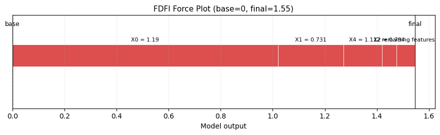
Per-sample UEIFs
After the explainer runs, explainer.ueifs_X stores per-sample X-space UEIFs. Use these for summary, dependence, waterfall, and force views.
[5]:
fig, ax = summary_plot(
    explainer.ueifs_X,
    features=X_test,
    feature_names=feature_names,
    show=False,
)
display(fig)
plt.close(fig)

fig, ax = dependence_plot(
    "X0",
    explainer.ueifs_X,
    X_test,
    feature_names=feature_names,
    interaction_index="X1",
    show=False,
)
display(fig)
plt.close(fig)

fig, ax = waterfall_plot(
    explainer.ueifs_X[0],
    features=X_test[0],
    feature_names=feature_names,
    max_display=5,
    show=False,
)
display(fig)
plt.close(fig)

fig, ax = force_plot(
    0.0,
    explainer.ueifs_X[0],
    features=X_test[0],
    feature_names=feature_names,
    max_display=5,
    show=False,
)
display(fig)
plt.close(fig)
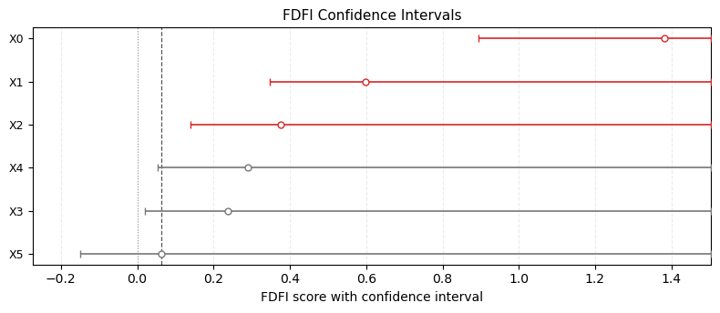
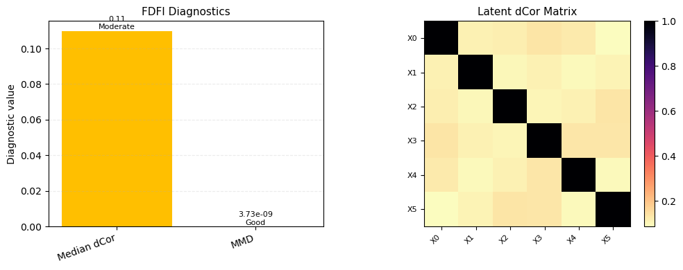
Inference and Diagnostics
confidence_interval_plot consumes conf_int() dictionaries. diagnostics_plot consumes the shared diagnostics dictionary from OT/EOT/Flow explainers.
[6]:
fig, ax = confidence_interval_plot(
    ci,
    feature_names=feature_names,
    show=False,
)
display(fig)
plt.close(fig)

fig, axes = diagnostics_plot(
    explainer.diagnostics,
    feature_names=feature_names,
    show=False,
)
display(fig)
plt.close(fig)